In 1989, the year HeroQuest was first released, I was heading off to university. I had a lot on my plate at the time and, sadly, my formative interest in board / role-playing games had plummeted to the bottom of my priority list. It was a different time, when admitting to liking such things out loud earned you a self-inflicted scarlet letter. If had a hope in hell of appealing to girls, I had to abandon such things and do my best to impersonate someone vaguely "normal."
As it turned out, my efforts were a mixed bag and all I really succeeded in doing is missing out on some friggin' cool games.
I distinctly remember talking myself out of buying HeroQuest when it was first released. The illustration on the back of the box, showing kids half my age enjoying the game, really made me hesitate.

I was a veteran AD&D player by that point, so I told myself that I was waaaay too long in the tooth to enjoy a game designed for ten-year-olds. Even still, the board, props and minis were so appealing to me that an invisible devil permanently parked itself on my shoulder and incessantly whispered in my ear to buy a copy. Even when it went out of print, that persistent l'il frigger begged for me to look it up on Ebay.
Back in 2011, I finally broke down. After scouring through our local online marketplaces, I finally found a decent-looking copy on Kijiji for $45.00. I brought it home, played it for a little bit and...decided that it was kinda underwhelming.
Had I been right about the game all along? Board games, particularly "dungeon-crawl" board games, had certainly evolved quite a bit over the intervening years. In light of this, old skool HeroQuest now felt like a relic of the past and, as such, I hucked it into the closet and just kinda forgot about it.
That is until two years later when a grass-roots movement began to bring a "new and improved" version of the game back to fans for it's 25'th anniversary. Soon, a Spanish company called Gamezone launched a Kickstarter to much fan-fare. Unfortunately, there was just one small problem: they hadn't bothered to secure the rights to the name HeroQuest. As a result, this nascent effort to revive a formative classic soon withered on the vine.
I'm sure that Hasborg...er, Hasbro quickly took note of how this ersatz Kickstarter for a new HeroQuest managed to raise $540.000 in four phreakin' days. I'm also pretty sure that's why the massive toy and game company began its own quest to re-acquire sole rights to the title and re-launch it under its own banner.
In a particularly-icky turn of events, Hasbro decided to re-launch the game through their own in-house crowd-sourcing channel, HasLab. In doing so, they managed to raise $3.7 million dollars in pre-sales. That right, this huge corporation (which made $5.1 billion dollars in 2021) made fans beg for their favorite squeak toy like dogs doing tricks to get a morsel of bacon.
Since, to me, crowd-sourcing equals rushed production, exorbitant conversion rates, obscene shipping, and under-baked stretched goals I typically don't jump at them. Besides, I get a pretty healthy retail discount, so I opted to wait until this sucka showed up at my FLGS. Expecting that they wouldn't get a copy until well into February, I put one on pre-order back on December 26'th...and was shocked to learn that they'd already received one the day before (!) and set it aside for me. A genuine Christmas miracle!
What follows is a superficial comparison between HeroQuest old and new. Just the components...nothing else. My play-through and review will follow at a later time.
Okay, let's start with the most obvious thing...
BOX ART DESIGN
The cover art for the older edition, by Les Edwards, has that classic Larry Elmore-esque vibe to it, while the new art is more angular and stylized. Also the color separation for the new cover art is ridiculously dark and murky.
The back of the new edition box is designed to assuage arrested-development-types (such as myself) that they didn't just buy "baby's first dungeon-crawl." Sorry, but I'm a sucker for the brighter art style. Plus, my heart goes out to the poor kids on the back of the box who, like me, were probably king shit on the gaming table, but woefully hopeless when it came to chatting with girls.
WINNER: 1989
BOX PRACTICALITY
The new box isn't as long but this thickness, gurl, you gotta witness! This is designed to house the (much appreciated) figure inserts and give space for theoretical expansions.The new box is also a helluva lot more durable and likely won't get crushed flat as a crepe just as soon as box of tissues is stacked on top of it.
WINNER: 2021
GAME MASTER'S SCREENS
The new one is bigger and, IMHO, the art is better.
Sorry, but I gotta give the duke to the new kid on the block here.WINNER: 2021
RULE BOOK & QUEST BOOKS
The reprint definitely has the slicker production values.
WINNER: 2021
THE GAME BOARD
Again, this one's a no-brainer:
The new board is bigger, with tweaked color and details and a border space to place props, figures or decks of cards. Fan will attest that the older board was nightmarishly-impractical when it came to moving figures around on, especially in rooms with a lot of furnishings. So, this is a very welcome change.
WINNER: 2021
TOKENS
This one's close, but the new tokens are more realistic and less cartoonish-looking. Also, at this point, I'm starting to suspect that my '89 wasn't quite as complete as that Kijiji seller said it was!WINNER: 2021
CHARACTER CARDS
The new Character art may be vastly superior, but the olde skool cards are bigger, chonkier and they even have a l'il character class write-up that evokes fond memories of the first few pages of the Red Box D&D Player's Manual.
WINNER: 1989
CHARACTER SHEETS
The newer Character Sheets are virtually identical, just bigger. In this kinda race, that's plenty enough to win!
WINNER: 2021
TREASURE CARDS
The art on the newer card backs may be more realistic but I really dig that 80's / TSR-style aesthetic on the originals. It's the other side of the card that clinches it for the newer version:
Between the dark borders, "parchment" style card face and vastly superior illustrations, the re-do comes out on top here!
Side note: the dude on the '89 "Potion of Defense" card looks like he fell out of the ugly tree and hit every branch on the way down.
MONSTER CARDS
I actually prefer the older, goofier card backs because the style reminds me of Russ Nicholson, one of my all-time favorite fantasy artists!
But, once again, the back side of the cards are objectively soooo much nicer...
I hear you folks saying out there "Hey, Dave, where's your new 'Orc' card?" to which I'd reply "I dunno...your guess is as good as mine." It was missing from my copy, but don't fret. After contacting Hasbro Consumer Care (hasbro_new@mailmw.custhelp.com), they're gonna mail one out to me. In theory.
Just a few more quick points. Since this new edition of the game was produced without the co-operation of Games Workshop, all references to "Chaos" (Warriors and Warlocks) as well as the "Fimir" (the name GW gave to their original crocodilian race) have been excised. Now we have "Dread" subbed in for "Chaos" and the very Lovecraftian "Abomination" taking the Fimir's place. More generic? Kinda, but definitely not a deal-breaker.
ARTIFACT CARDS
My remarks about the Treasure Cards also apply here.
Unlike the previous two card types, I unequivocally prefer the art on the back of the new Spell Cards.
Whoof, those older elementals are pretty goofy-looking, particularly the djinn on the Air Spell Cards.
CHAOS / DREAD SPELLS
Here's another thing altered by the separation from Games Workshop.
Basically, my opinion about all of the cards boils down to this: as charming as the art is on the card backs, the superior look of the text side of the cards sways me towards the newer versions!
WINNER: 2021
EQUIPMENT CARDS / INSERT
This comparison is kind of interesting, since the OG version didn't have an Equipment Deck, it just summarized everything on the insert, which I kinda liked.
Here's what the new Equipment Cards look like:
The flip-side:
I'm sure the cards are more practical for game-play, but, damn, I really like that Armory insert, which also neatly summarizes the terrain and furnishings in the dungeon.
WINNER: 1989
Side note: this shiny new version also includes some rules summary cards, which are always a welcome addition!
THE DOORS
Um, I'm talking about the furniture in the game, not the band.
Easy win for 2021 here, since the original portals were easily-bendable cardboard mounted in a featureless plastic base.
PROPS AND FURNITURE
There some examples in this category where the new edition is vastly superior.
For example, even though the OG Tomb had a fair amount of detail, it was also saddled with a cardboard base. Besides, the new one has a removable top! Whaaaat?!?
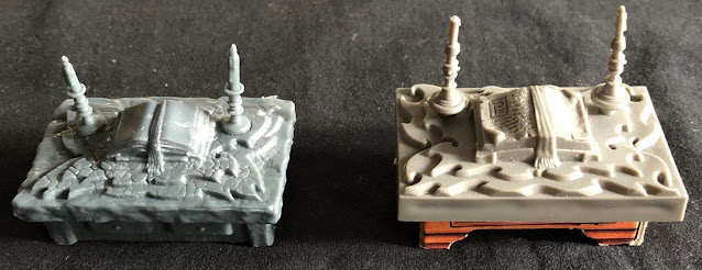
The "wood" look of the cardboard art on the original Tables is nice, but the plastic bands holding them together are waaaay too chonky. As a single piece of plastic, the new ones are clearly more durable and also look more proportionate.
This goes doubly-so for the Thrones, Treasure Chests, Bookcases and Cupboards.
Granted, the cardboard is much more susceptible to damage, but it's also not a singular, monochromatic hunk of brown plastic like the newer version. I also like the fine details on the original Cupboards and Bookshelves, namely the skulls and rats.
Full disclosure: the new version actually includes a smattering of separate skulls and rats that you can just sprinkle around all over the place like some deviant Salt Bae. It's a nice touch.
To give credit where it's due, there's a ton of surface detail on the new sculpts and I think they'd look incredible with even the most basic application of paint.
Still, when you look at these things right out of the box, I actually think that the originals are more visually appealing. Take the Fireplace, for example.
But, hey, I gotta be realistic. Even though it offers a pop of color, there probably aren't very many original Fireplaces still intact out there.
In some ways, the OG Sorcerer's Table is superior. It may not have the same surface detail on the top of the altar, but the spell book is actually covered in detailed runes!
Again, if it wasn't hampered by the cardboard base, the original Alchemist Bench is comparable to, if not better than, the new version. In fact, the '89 Bench has different colored details, a movable set of scales and, once again, writing on the papers! Pretty impressive.
Conversely, the new Rack looks legit scary.
It's worth mentioning that the plastic used for the props and minis in the original HeroQuest was made from a more rigid, and subsequently fragile, material.
In some ways, that's good, but in other ways it kinda sucks. Take the Weapon Rack, for example. The new one has more detail, even going so far as to include the Black Defense symbol on one of the shields. Unfortunately, my newer weapon rack is bent to shit and really a hot water bath to do some adjustments.
In summary, even though a few of the older bits look more visually appealing straight out of the box, the new Furniture sculpts are all universally impressive. Then, when you factor in just how easily the cardboard elements can be damaged, I gotta give the win to the new blood.
WINNER: 2021
MINIATURES
I'm a sucker for those chunky, 80's-era Games Workshop sculpts. The knock-kneed Zombie (second in from the left in the pic below) really cracks me up.
The new figure poses are a lot more dynamic, with the mummy resembling Iron Maiden's Eddie from one of the Powerslave promotional posters.
Notwithstanding the fact that the new figs are hella-detailed and posed more naturally, those GW figs are pretty iconic. I really dig the Chaos Warlock, pictured below on the far right. Just look at the ham-hocks on him. He's all like: "Come here, my beamish boy...and give us a hug!"
Speaking of iconic, is there anything more recognizable in fantasy gaming than a Games Workshop Goblin or Orc? I absolutely love these l'il guys.
As for the new Goblins, they look decidedly Pathfinder-esque. I really like the dude on the far left who's lunging at the heroes.
Sure, the older plastic was brittle and would easily break if you stepped on it, but at least it retained it's shape. Made from the same sort of pliable plastic used in modern board games such as Descent, many of my new Orc figures are warped as hell.
Oh, and props to Hasbro for including some female sculpts for the monsters as well.
Can't say that I miss the Fimir all that much...they're pretty bland-looking creatures. The Abomination, on the other hand, looks positively bad-ass, even though it's clearly Deep One with the serial numbers filed off.
Man, those older sculpts really do conjure up fond memories of looking pictures of Games Workshop, Citadel and Ral Partha minis in Dragon magazine. As a kid, I didn't have a lot of cash and chose to buy the manuals instead of minis, so I didn't own very many figures. I think I've been overcompensating for that ever since!
Again, I'm not thrilled about the bendy plastic, but even I have to concede that the new minis just look more realistic and dynamic.
WINNER: 2021
***
OVERALL WINNER: HeroQuest 2021
Let the record show that I absolutely adore 1989 HeroQuest's aesthetic charms. I love the retro art design and the Mark-I miniatures.
But, nostalgia goggles aside, I have to give the overall win to new HeroQuest. Though I'm loathe to admit it, Hasbro did a great job in bringing this venerable classic back to life.
Okay, so, that's the look of the game...but how does it play? Next up: my play-though and review of this spruced-up revival. Will it be worth the effort or was it all for naught!
Stay tuned, kiddies!


Nice write up. Just a heads up, your 2021 bookshelf and cupboard images are upside down.
ReplyDeleteThey sure are! D’oh!!! 🤦♂️
DeleteLove it. Objectively the newer production techniques seam to win out but you can't beat the 90s aesthetic.
ReplyDeleteAgreed. I have a real soft spot for those early Warhammer-esque minis.
DeleteIf you were underwhelmed with HeroQuest in 1989 I'm pretty sure if Cindy Crawford and Pamela Anderson asked you for a full body massage you'd say nah, not impressed
ReplyDeleteI wasn't underwhelmed by 89's production quality, my dude, I was underwhelmed by the simplistic rules. I'd already been playing D&D for five years and, by then, OG "HeroQuest" was waaaay too simplistic for me.
DeleteSoooo, to tweak your analogy, AD&D was my Cindy Crawford.
Good review. However, when it comes to the equipment cards, I'm 90% sure that the Danish language version had those! (It also came out a bit later, if memory serves..)
ReplyDeleteYou are right the new one has to be better because technology and artwork has evolved but we all still love the retro looks. Glad to say I still have mine fully intact and my Advanced HeroQ with 2 sets of tiles so I can double the width of the passageways
ReplyDelete